Do not use -- Materials
in this module now part of Module 10
Module 9 - FUNCTIONAL FORM & PARTIAL REGRESSION
PLOTS
1. USES OF PARTIAL REGRESSION PLOTS
Various diagnostic tools and remedial measures
are available to adress possible violations of the classical assumptions
of multiple regression analysis. The most common tool is the residual
plot in which the residuals ei are plotted against the estimates
(aka predictors) ^yi. From the appearance of the
plot we may be able to diagnose a variety of problems with the model (such
as heteroskedasticity, nonlinearity, outlying observations, etc.) in the
same way as for simple regression models ( see Module 3).
Partial regression plots are another diagnostic
tool that permits evaluation of the role of individual variables within
the multiple regression model. They are used to assess visually
-
whether a variable should be included or not in
the model
-
the presence of outliers and influential cases
that affect the coefficients of individual X variables in the model
-
the possibility of a nonlinear relationship between
Y and individual X variables in the model
A partial regression plot is a way to look at
the marginal role of a variable Xk in the model, given that
the other independent variables are already in the model.
2. CONSTRUCTION OF A PARTIAL REGRESSION
PLOT
Assume the multiple regression model (omitting
the i subscript)
Y = b0
+ b1X1
+ b2X2
+
b3X3
+ e
There is a regression plot for each one of the
X variables.
To draw the partial regression plot of Y on
X1 "the hard way", for example, one proceeds as follows:
1. Regress Y on X2 and X3
and a constant, and calculate the predictors and residuals
^Yi(X2, X3)
= b0 + b2Xi2 + b3Xi3
ei(Y|X2, X3)
= Yi - ^Yi(X2, X3)
2. Regress X1 on X2
and X3 and a constant, and calculate the predictors and residuals
^Xi1(X2, X3)
= b0+ + b2+Xi2 +
b3+Xi3
ei(X1|X2,
X3) = Xi1 - ^Xi1(X2, X3)
3. The partial regression plot for X1
is the plot of
ei(Y|X2, X3)
against ei(X1|X2, X3)
In practice, statistical programs such as SYSTAT
have options to save the partial residuals ei(Y|X2,
X3) and ei(X1|X2, X3)
when estimating the regression model, so one does not need to do these
auxilliary regressions separately.
3. INTERPRETATION OF A PARTIAL REGRESSION
PLOT & AN EXAMPLE
It can be shown that the slope of the partial
regression of ei(Y|X2, X3) on ei(X1|X2,
X3) is equal to the estimated regression coefficient b1
of X1 in the multiple regression model Y = b0
+ b1X1
+ b2X2
+
b3X3
+ e .
Thus the partial regression plot allows us to isolate the role of the specific
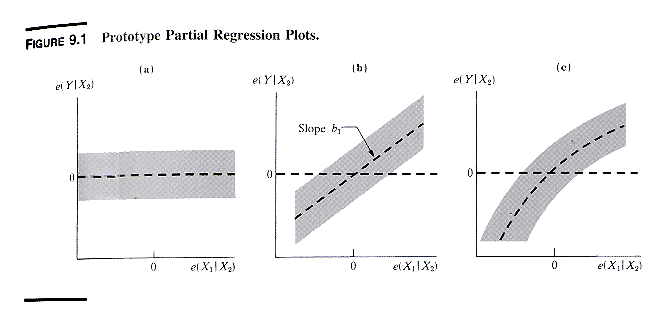
independent variable in the multiple rgeression model. In practice
one scrutinizes the plot for patterns such as the ones shown in the next
exhibit.
The patterns mean
-
pattern a, which shows no apparent relationship,
suggests that X1 does not add to the explanatory power of the
model, when X2 and X3 are already included
-
pattern b suggests that a linear relationship
between Y and X1 exists, when X2 and X3
are already present in the model. The slope of the partial regression
line is the same as the coefficient of X1 in the multiple regression
model
-
pattern c suggests that the partial relationship
of Y with X1 is curvilinear; one may try to model this curvilinearity
with a transformation of X1 or with a polynomial function of
X1
-
the plot may also reveals observations that are
outliers with respect to the partial relationship of Y with X1
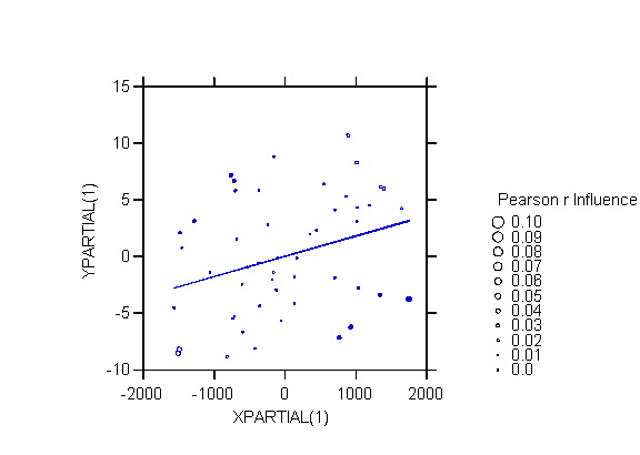
As an example we look at the Graduation Rates
file GRAD.SYD used in a previous assignment. The dependent variable
is GRAD, the state rate of graduation from high school. We estimate
the model
GRAD = CONSTANT + INC + PBLA + PHIS
+ EDEXP + URB.
The data and the regression results are shown
in the next 2 exhibits.
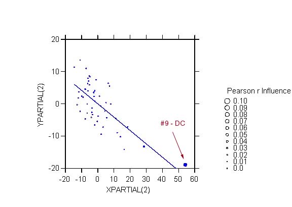
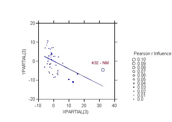
We look at the partial regression plots for INC,
PBLA, and PHIS.
The following link shows how to do the same partial regression plots in
STATA.
As an extra refinement these partial regression
plots use the INFLUENCE option of SYSTAT. In an influence plot the
size of the symbol is proportional to the amount that the Pearson correlation
between Y and X would change if that point were deleted. Large symbols
therefore corespond to observations that are influential. The plots
allow us to identify cases that are problematic with respect to specific
independent variables in the model. For example, two observations
stand out: DC in the plot for PBLA, and NM in the plot for PHIS.
The style of the symbol indicates the direction
of the influence:
-
an open symbol indicates an observation
that decreases (i.e., whose removal would increase) the magnitude
(absolute value) of the correlation; for example, removing NM (case 32)
in the partial regression plot for PHIS would increase the magnitude of
the correlation between YPARTIAL(3) and XPARTIAL(3) from -.461 to -.558.
-
a filled symbol indicates an observation
that increases (i.e., whose removal would decrease) the magnitude
(absolute value) of the correlation; for example, removing DC (case 9)
in the partial regression plot for PBLA would decrease the magnitude of
the correlation between YPARTIAL(2) and XPARTIAL(2) from -.703 to -.641.
As I was not sure of the statistic used to determine
the size of symbols with the INFLUENCE option I sent questions to the SYSTAT
users list, which were answered by SYSTAT's founder Leland Wilkinson.
It turns out that SYSTAT calculates the influence of an observation very
simply as the absolute value of the difference in the correlation coefficient
of Y and X with and without that observation.
Last modified 8 Apr 2003